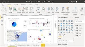
Power BI is a cloud-based business analytics service that gives you a single view of your most critical business data. Monitor the health of your business using a live dashboard, create rich interactive reports with Power BI Desktop and access your data on the go with native Power BI Mobile apps.
Introduction to Power BI
Power BI is a business analytics service by Microsoft that provides interactive visualizations and business intelligence capabilities with an interface simple enough for end-users to create their own reports and dashboards. Power BI can connect to many data sources and provides powerful data modeling and transformation capabilities.
One of the key advantages of Power BI is its ability to integrate with other Microsoft services such as Excel, SharePoint, and Teams. This means that users can access and analyze data from a variety of sources in a single location, making it easier to gain insights and make informed decisions.
With Power BI, businesses can turn data into insights, monitor business performance, and quickly react to changes in their environment. Power BI provides users with the ability to create interactive dashboards, reports, and charts that can be accessed and shared across the organization.
Power BI for Data Analysis and Visualization
Power BI is a powerful tool for data analysis and visualization, offering a range of features to help businesses make sense of their data. With Power BI, users can easily connect to a variety of data sources, including Excel spreadsheets, cloud-based services like Azure and Salesforce, and on-premises databases.
Once data is connected, Power BI offers a range of data modeling tools that enable users to create custom data models that can be used to drive visualizations and reports. These tools include the ability to create calculated columns and measures, as well as to define relationships between tables.
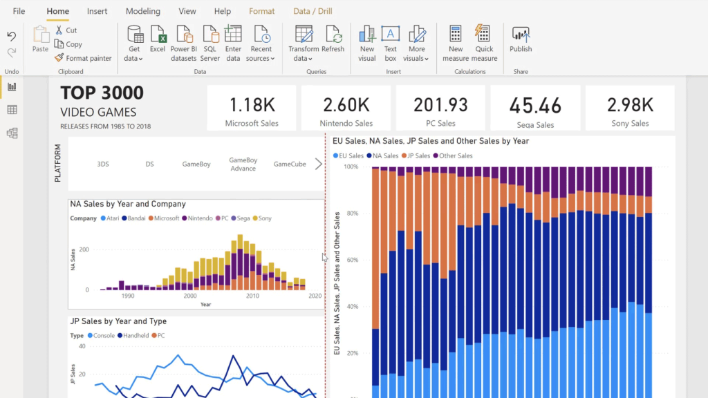
With the data model in place, users can create visually compelling dashboards that provide a real-time view of key business metrics. Power BI offers a range of drag-and-drop visualization options, including charts, graphs, and tables, as well as custom visuals created by third-party developers.
Users can also build reports in Power BI, using a variety of visualization types and formatting options to present their data in a clear and compelling way. Reports can be saved and shared with others, making it easy to collaborate on data analysis and visualization projects.
Data Modeling in Power BI
Data modeling is the process of creating a conceptual representation of data for analysis and reporting. Power BI offers robust data modeling capabilities that allow users to create relationships between different data sources, define hierarchies, and add calculated columns and measures.
Data Modeling is a crucial step in creating effective Power BI dashboards and reports. With Power BI’s data modeling tools, users can easily create a data model that integrates data from multiple sources and defines relationships between them. The data modeling process involves importing and transforming data, defining relationships between tables, creating calculated columns, and creating hierarchies.
Power BI allows users to create relationships between tables by defining primary and foreign keys. Users can also create calculated columns and measures to perform complex calculations on data, such as aggregating or filtering data. Additionally, Power BI’s data modeling tools support the creation of hierarchies, which can be used to group data into meaningful categories for easy analysis. Overall, the data modeling features in Power BI make it easy to create a well-organized and efficient data model that can be used for creating reports and dashboards.
Power BI Desktop vs. Power BI Online
Power BI comes in two forms: Power BI Desktop and Power BI Online. Power BI Desktop is a Windows application that you download and install on your computer, while Power BI Online is a cloud-based service that you access through a web browser.
Power BI Desktop is more powerful and flexible than Power BI Online, and is designed for creating complex reports and data models. It also allows you to work offline, and has advanced features such as custom visuals and R integration.
Do more with less using an end-to-end Power BI platform to create a single source of truth.
Uncover more powerful insights, and translate them into impact.
Power BI Online, on the other hand, is more accessible and easier to use for beginners. It has a user-friendly interface, and allows you to collaborate and share reports with others online. It also has built-in features such as data refresh and data modeling, making it a great choice for simple reporting tasks.
Power BI Desktop is ideal for advanced users who need full control over their data models and reports, while Power BI Online is great for teams and organizations that want to collaborate and share reports quickly and easily.

Creating Dashboards in Power BI
Dashboards are an important part of data visualization and are used to display key performance indicators and other important metrics. Power BI provides a simple drag-and-drop interface for building dashboards, and users can choose from a wide range of visuals to create visually appealing dashboards.
To create a dashboard in Power BI, you’ll first need to connect to your data source and import your data into Power BI. Once you have your data loaded, you can begin creating your dashboard by selecting the “New Dashboard” option in the left-hand pane. From there, you can add visuals to your dashboard by selecting them from the “Visualizations” pane and dragging them onto your dashboard canvas. You can also customize the layout of your dashboard by rearranging the visuals, resizing them, and adding text boxes and images.
To ensure that your dashboard is visually appealing and effective at communicating insights, you should consider the following best practices: use a clear and concise title, organize your visuals in a logical order, use consistent colors and fonts, and minimize clutter. Additionally, you can take advantage of Power BI’s formatting options to customize the appearance of your visuals, including changing colors and fonts, adding borders, and applying visual effects. Once you’re happy with your dashboard, you can share it with others by publishing it to the Power BI service or embedding it in other applications.
Building Reports in Power BI
Reports are used to provide more detailed analysis of data than dashboards. Power BI offers a variety of visualization types and formatting options to create reports that are both informative and visually appealing.
When building a report in Power BI, it’s important to consider the type of data being presented and how it can be best visualized. Power BI offers a wide range of visualization types, including tables, charts, maps, and gauges, which can be used to represent different data points. Once the appropriate visualization types have been selected, the next step is to apply formatting options to make the report visually appealing and easy to read. This can include customizing colors, fonts, and labels, as well as adding images or logos.
In addition to choosing the right visualization types and formatting options, it’s important to ensure that the report is interactive and user-friendly. Power BI allows users to create filters and slicers, which enable users to slice and dice the data according to their preferences. Reports can also be shared with others, either by publishing them to the web or embedding them into a website or application. With Power BI’s drag-and-drop interface and wide range of customization options, building visually appealing and interactive reports has never been easier.

Sharing and Collaborating in Power BI
Power BI allows users to share dashboards and reports with others, including collaboration options like commenting and sharing. This section can cover how to share a dashboard or report in Power BI, including configuring access and permissions, collaborating with others, and publishing reports to the web or to SharePoint.
Advanced Features in Power BI
Power BI offers a range of advanced features, including data analytics, custom visuals, and integration with other tools. This section can cover some of the more advanced features of Power BI, including how to perform data analysis using DAX, creating custom visuals using the Power BI developer tools, and integrating Power BI with other tools like Excel.
DAX: the new gorilla on the block!
DAX stands for Data Analysis Expressions, and it is a formula language used in Power BI, Excel Power Pivot, and Analysis Services Tabular models. It is designed to allow users to create custom calculations and aggregations on data within these tools. DAX is a syntax similar to Excel formulas but has additional functions and capabilities for working with relational data.
DAX allows users to perform complex calculations and analysis on large datasets, including filtering, grouping, and aggregation. It also supports calculations based on time periods and custom hierarchies. DAX can be used to create measures, which are calculations based on data in a dataset, as well as calculated columns, which are new columns created from existing data. By using DAX, users can create powerful data models and visualizations in Power BI and Excel Power Pivot that can help them make better business decisions.
References
- Data Visualization | Microsoft Power BI
- Business intelligence topics
- Get samples for Power BI
- Power BI – Demo Videos and Guided Tours | Microsoft Power BI
- Explore Power BI (Infographics)
- Ebook Top 10 reasons why customers choose Microsoft Power BI
